Anywhosit.... I knew when I came back I was gonna redo the whole enchilada. I did a new template and layout. I wanted a more "me" blog.
When I went out looking for a new template I knew I wanted ad space, 4 columns, and room on the bottom and I found Ipietoon's Not Magazine template.
*free download btw*
*click to enlarge all pictures*
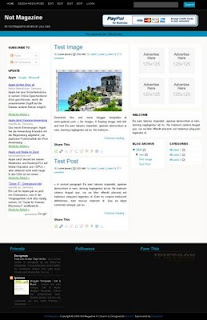
Thats how it looked when I got it. Looks nothing like my page right. That's because I "tweaked" it.
And heres how.
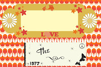
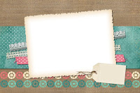
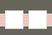
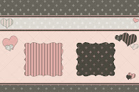
So you know there are tons of digital scrapbook programs and sites out there. I happen to love scrapblog (dot) com. Some stuff costs, but there is plenty of freebies. Cute freebies. I haven't spent a penny on my site.
They have tons of fonts heres a few examples:
Find a theme you love and you can do everything there.
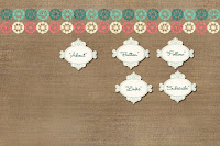
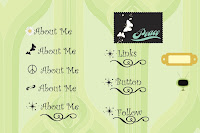

After you make these simply download to your computer and use something like photobucket to crop and resize. "Save a copy" so you can cut out each one. Use their code to place on your blog.
For backgrounds
Simple-
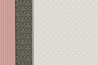

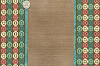
Same thing download it and then upload through photobucket. Only this time you will only use the direct link.
and you put it in your edit html part where you see "body {" you would put in this under it:
background:$bgcolor;background-image:url('direct link');
background-position: center;
background-repeat:yes-repeat;
background-color:transparent;
width: 960px;
height:350px;
font-size: 11px;
margin: 0 auto 0;
padding: 0;
overflow: hidden;
color:#000000;
Now I say back up your template. You dont want to have an oopsie and hate me.
Photobucket is a cool place cause you can crop and resize and its free. You get a huge amount of space you can use.
To add things like your signature at the bottom of your post I used my live signature (dot) com.
You put that code above this:
< div class =' post-footer '>
For scrolling boxes for awards, buttons etc you would put this before the button code
If you have neat ideas I love to hear them.
.jpg)


7 Sweet Comments:
I'm a fairly new blogger too and I'm so envious of all these cute blogs with fancy stuff on them. I'm learning as I go. I don't know how to do much with website design. I was trying to figure out how to do the moving blog roll things like you have on your side bar.
Oh wait i see how you have that posted, for the moving awards, blogs, etc I just put that code before the button when putting it on my blog? Do I have to do it before I add each button or only once in the gadget?
hmm can't get it to work. Put it before one of the blog buttons and all i see is the word blog scrolling up and down and my buttons aren't moving. Tried puting it in between each one and same thing. I'll keep working on it though
Where I put "Buttons" in capital letters is where you put the all the codes for the buttons. from the first (< a> ) to the last () ☺
I appreciate you so much for posting this as I have been wanting to tweek mine as Blogger doesn't really let you do what you really want to do with your page.
Peace, Love and Chocolate
Tiffany
oh sorry, see i'm so slow when it comes to this kind of stuff. I'll bet it would work like that
That's super cool! You are smart to do it that way!! Thanks for the follow, I am returning it now!
Post a Comment
◄▬▬▬| ♥۩۞۩♥ WELCOME ♥۩۞۩♥ |▬▬▬►
Sprinkle you with comment love
☆჻*´¯`*჻☆჻*´¯`*჻☆჻ (✿◠‿◠)☆჻*´¯`*჻☆჻*´¯`* ჻☆჻ ☆჻*´¯`*჻☆჻*´¯`* ჻☆჻☆჻*´¯`*჻☆჻*´¯`* ☆჻*´¯`*჻☆჻*´¯`*჻☆჻ (✿◠‿◠)☆჻*´¯`*჻☆჻*´¯`* ჻☆჻☆჻*´¯`*჻☆჻*´¯`*჻☆჻(✿◠‿◠)☆჻*´¯`*჻☆჻*´¯`*(✿◠‿◠)
๑۩๑ ๑۩๑Thanks For Stopping By (✿◠‿◠)๑۩๑ ๑۩๑